Projects
N1X10 - CANCER MANAGEMENT APP
Web Design • User Experience • Wireframes • Personas • User Interface • Flowchart
Project Overview
N1X10 is an Israeli startup with a mission to make cancer case management services more accessible. To achieve this, N1X10 is developing software that includes a desktop app for medical professionals, and a mobile app for clients.
My Contribution
I have been working with N1X10 for three years during which I have been the only designer on the team, so everything you see I created myself. I was involved in everything from defining personas, creating user flows, conducting user interviews, creating wireframes, all the way to designing the final UI.

About the Client
N1X10 is an Israeli startup with a mission to make cancer case management services more accessible. For many cancer patients, managing their disease is very stressful. Not only do they feel unwell and vulnerable, they are also called to navigate through many different types of treatments, different professionals and new experimental therapies. Professional case managers can help patients navigate, but this service is very expensive and not accessible to everyone.
N1X10's solution is to make case management an easier task through the use of technology. We developed a system that includes a desktop app for professionals and a mobile app for patients.
Defining Personas
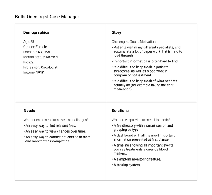
I researched to find out as much as I could about the two types of users and conducted interviews with oncologists, cancer patients and their family members. This led to the creation of two main presonas that guided our decisions moving forward.

Defining the Flow
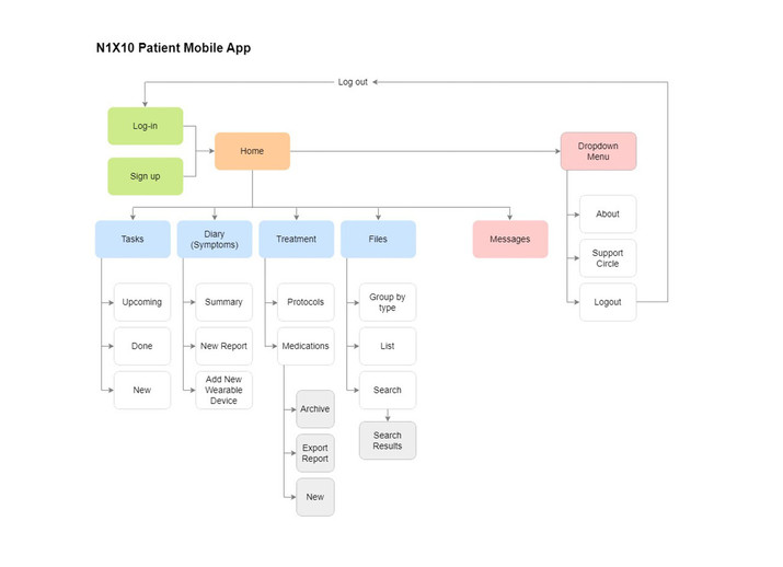
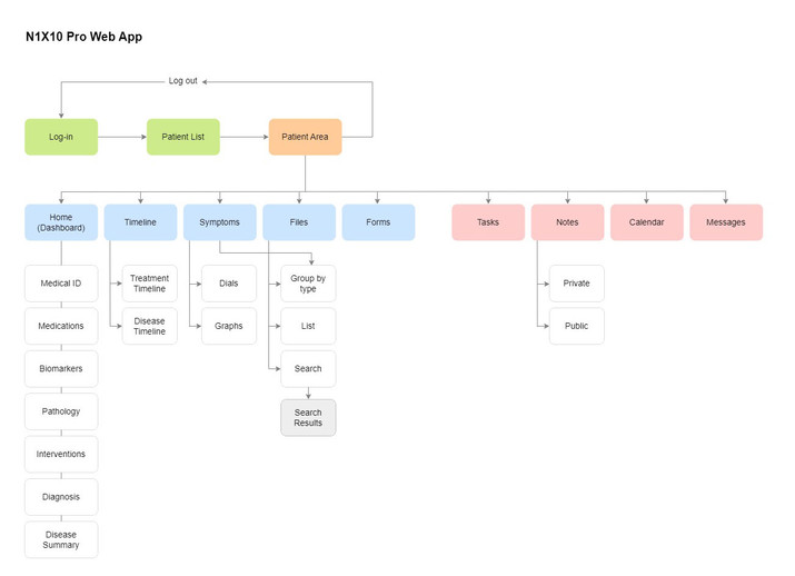
Then after getting a better understanding of what the users main pain points are, I created a flowchart to show how the system would be organized. This flowchart changed overtime with the addition of new features.
The Professional Web App
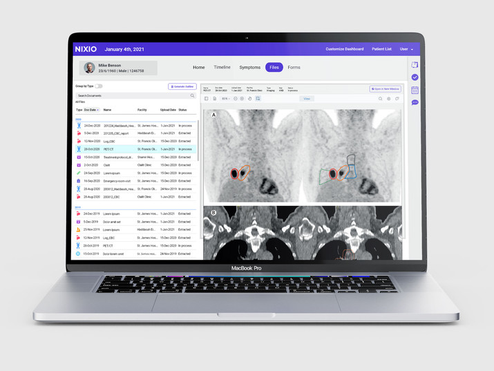
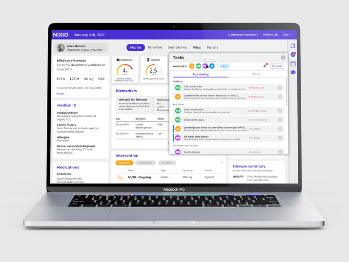
The professional app includes a dashboard that presents all the most important information at a first glance. A timeline which shows important events such as chemotherapy treatments or ER visits, alongside blood markers. A symptoms page presenting symptoms uploaded by the patient. A files directory with a smart search and with a group by type filter. The professionals can also task their patents, message them and make appointments.
I began the design process with simple wireframes, in order to explore the experience in more detail. This part of the process was accompanied by frequent usability testing and subsequent user interviews. The platform evolved over time. Below see the evolution of the timeline feature and some of the final UI.
The Patient Mobile App
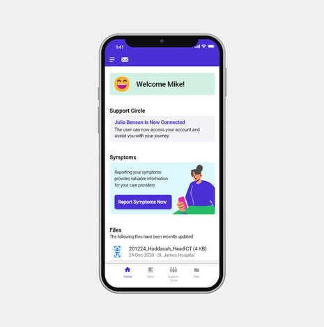
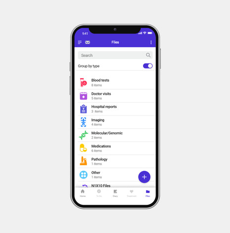
The patient app includes a file directory for patients to store all of their information and navigate through it easily (with a smart search and group-by-type view). There is a diary page that allows patients to upload their symptoms and view their previously reported symptoms. There is a treatment page that summarises all the treatment steps according to the protocol, and allows patients to keep track of their medications. There is also a tasking system.
I present here some of the process, from paper wire frames to the final UI design.
